
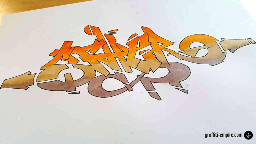
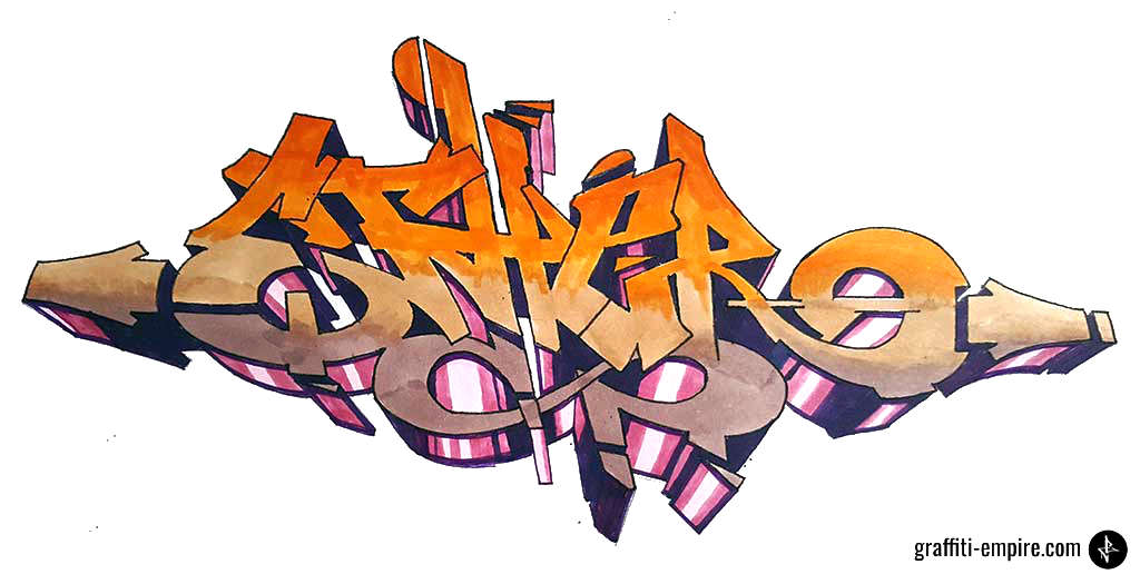
In this post, I will show you the concept of how I draw the graffiti shown in the picture below.
For a quick start for total beginners, you can also skip to a step-by-step tutorial or our graffiti generator instead.
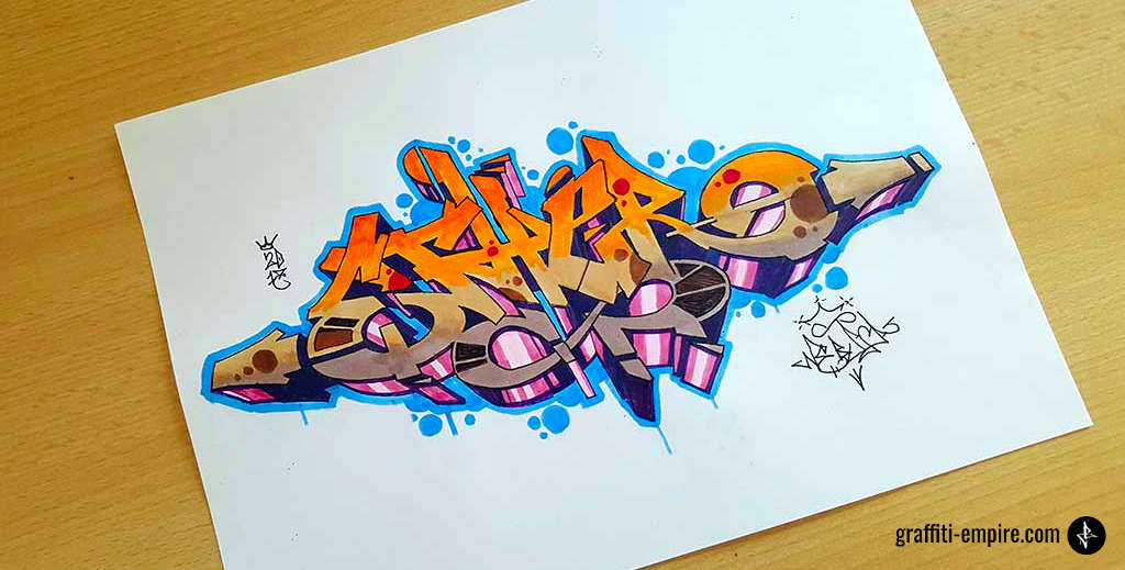
1. Basis: A Graffiti Tag
A graffiti tag is the basis of the design of a graffiti piece.
Think about a name you want to use as a sprayer. No ideas yet? Just start out with your real name!
We provide several designs for each letter in our graffiti letters collection. You can use it as a source of inspiration and draw your first graffiti tag this way.
I wrote a more in-depth article about graffiti tags and handstyles and how to construct them. You may want to check it out as well.
So, step by step:
- Get a marker (e.g. Stylefile); not a pencil; Tags look way better if you use the right marker – I used a Stylefile marker with tri nib tip for the graffiti tag.
- Get a piece of paper
- Go to my collection of graffiti letters
- Search for the letters of your name
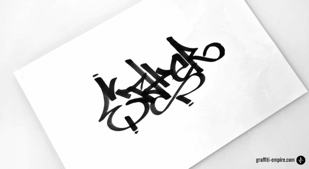
Example
I chose the word “Ether”
Attention: If you use markers, you should probably use a cutting mat. If you just write on paper, your marker will write through the paper on your desk!
Side note: If you search for a cutting mat on Amazon, please consider reading the bad reviews. If you find a review about bad oder coming from the mat there, do not buy this particular product. You cannot get rid of this smell. I also did not pay attention to it, when I bought my first cutting mat and I regretted that decision.
2. How to Draw Graffiti: Your First Graffiti Sketch in 7 Steps
Have you redrawn your first graffiti? Have you created your first tag? Nice!
So, let’s move on!
Graffiti pieces are very complex. To start out, I would recommend taking your tag and transforming it into a graffiti piece.
Every graffiti piece consists of the following parts:
- The fill-in: colored areas
- The outline: colored or black line around the fill-in
- 3D blocks
- A background
- A keyline: the line that runs around the whole piece
- The tag of the sprayer
- Optionally: highlights
- Optionally: the year of creation
I use the following materials:
- A standard multipurpose copy printer paper
- Staedtler Eraser
- Staedtler pencil – 2B grade
- Posca markers PC 1MR 0.7mm for highlights and outlines
- Copic Markers Multiliner 0.5 for outlines
- Copic Ciao markers or Stylefile brush markers for fill-ins
So, let’s get started:
Step 1: Trace Your Graffiti Tag
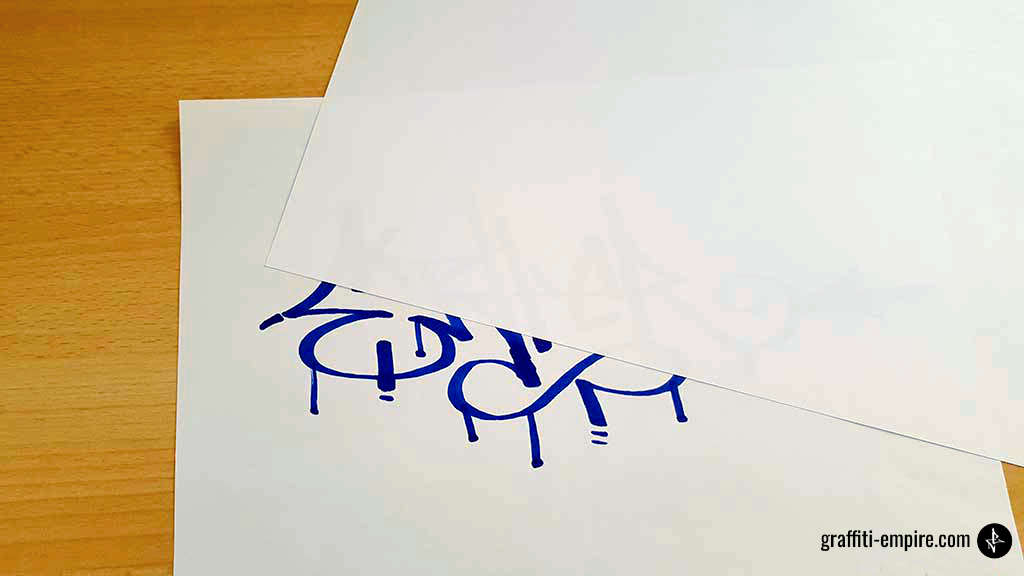
If you used a marker before, you will probably see the graffiti tag through the piece of paper to trace it. So, your first task is it to trace the edges of the lines with a pencil.
However, leave a little bit of space between the edge of the marker and your new pencil line so the letter gets bigger.
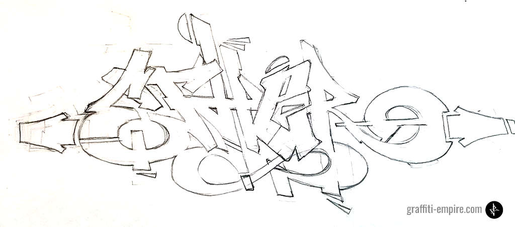
The result should look like the image shown below. This is not that bad, but we want to improve it.
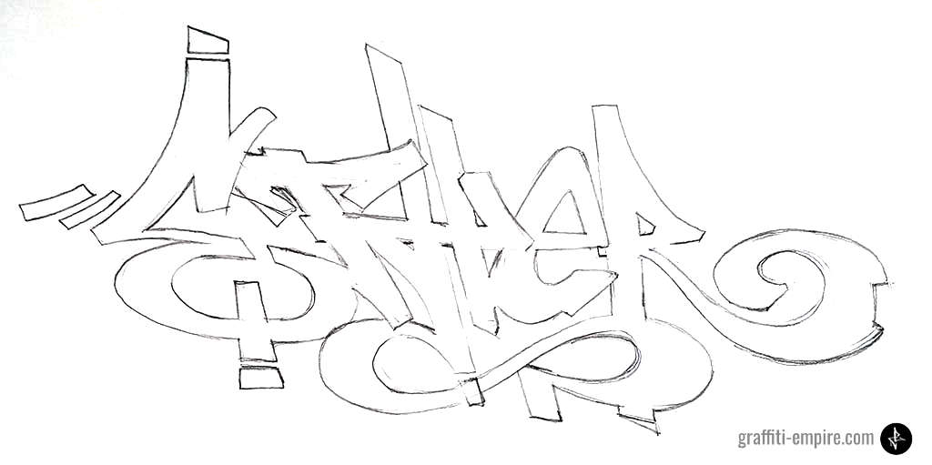
Step 2: Improve the Graffiti
The composition of the whole graffiti is important as well. The “E” at the beginning is bigger than the “R” at the end. So, I chose to make it smaller and add arrows on both sides to create a compact form.(red). I also added serifs and made them more complex.(blue circles).
In typography, a serif is a small extra stroke attached to the end of the main vertical and horizontal strokes of a letter. In graffiti, you often use them to make your artwork look more complex.
I also added forms which improve the composition of the graffiti.(green circles)
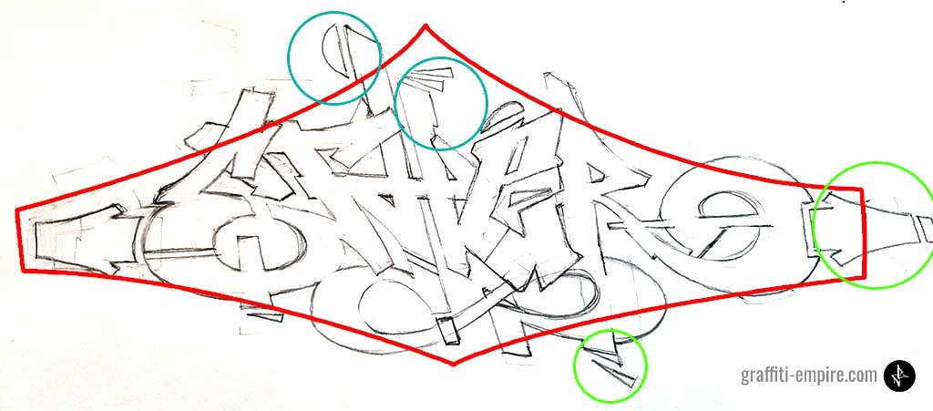
The result looks like the image below.
This step is usually made by trial and error, and takes some time to master.
So, don’t be upset if the graffiti does not look like you imagined immediately.
Even if you practice drawing graffiti a lot, this step will take some time and you will have to use the eraser quite often.
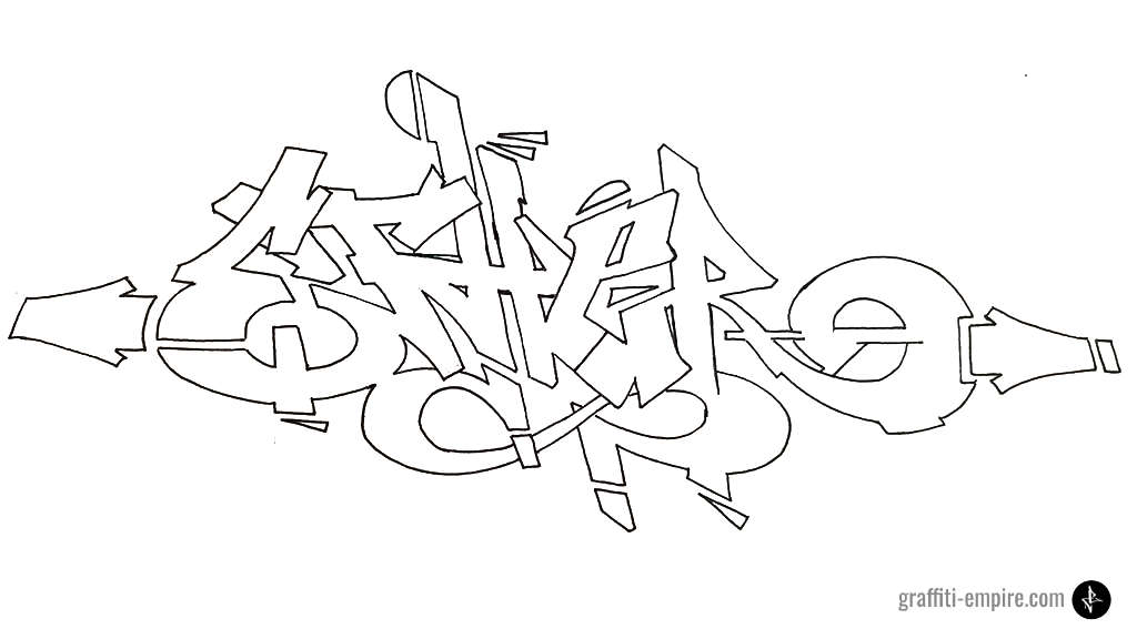
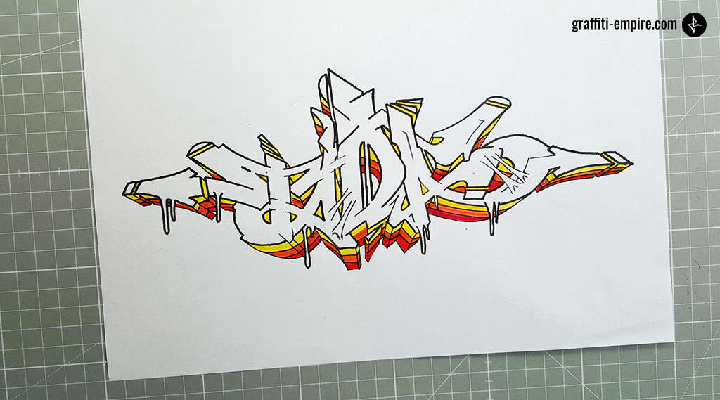
Step 3: Redraw the Lines With a Fineliner
The next step is much easier. Take your Posca markers PC 1MR 0.7mm or Copic Markers Multiliner 0.5 and redraw your pencil lines.
Wait some time to let the color dry. Afterwards, erase all the pencil lines afterwards. The result should look like this.
Tip: Copy your drawing at this point. If you are not happy with the colors you choose afterwards, you don’t have to restart the whole process again.
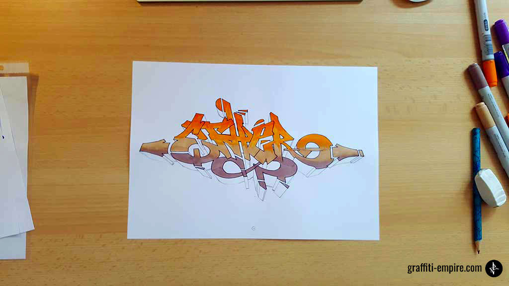
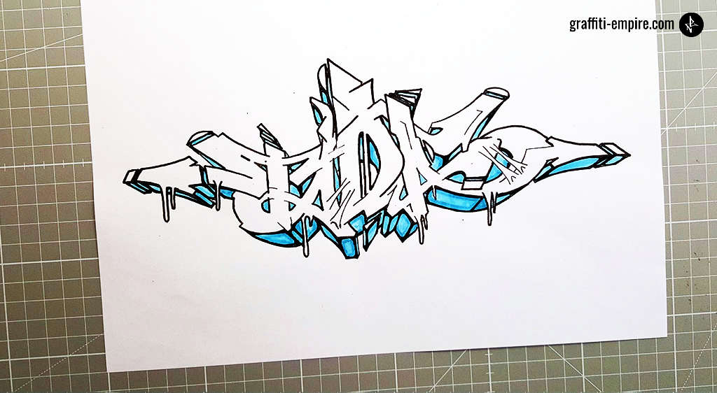
Step 4: Color Your Graffiti Sketch
To make the coloring look more complex, I would always recommend to drawing gradients.
In this case, I colored the whole graffiti in one big gradient.
If you want to make your drawing to look even more complex, you will have to add a different gradient to each letter.
Step 4.1 Which Colors Should I Use?
In general, I recommend using complementary colors for either:
- Foreground and background
- Fill-ins and 3D blocks
If you want to use more colors, you should use colors of the same color shade.
You can also just search for a graffiti on Instagram or Pinterest and copy the colors. If you are a beginner, this approach will probably be the best.
Glossary
- Complementary colors: colors that are positioned opposite to each other on a color wheel
- Adobe Color CC is an example of a color wheel. Colors are placed on a circle based on a color theory. You can also use the Adobe Color CC color wheel as a tool to choose colors.
Step 4.2 Color theory
Well done color combinations are the basis of good fill-ins and coloring graffiti.
Using gradients is the secret of good coloring. Note that the gradient of the fill in is usually done by choosing 2-4 shades of one color.
The easiest way to find color combinations, is by going to the following website https://color.adobe.com/
You will find a color wheel there. Most of the color theories are based on color wheels. They just defer a bit from each other.
The strongest color contrast is known as “complementary contrast”.
So, just choose “complementary” in the dropdown menu in the top left of the website and adjust the wheel to find your preferred color combination.
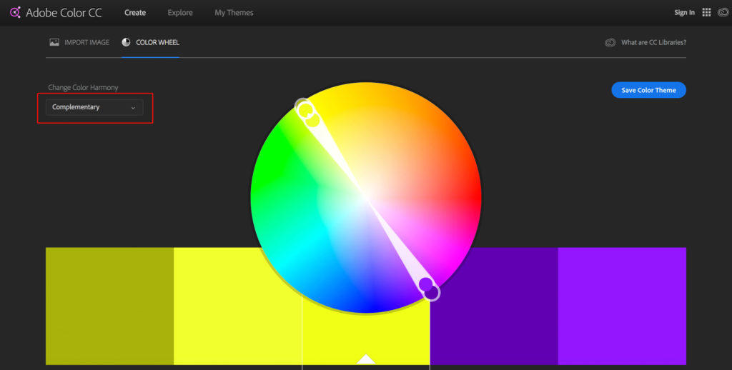
Now use shades of one color for the fill in of your graffiti and the second color for the shadows or your background/outlines.
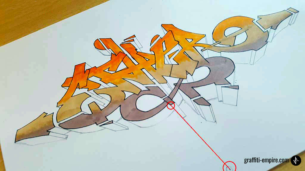
Step 5: Drawing the 3D Blocks
One way of drawing 3D graffiti blocks is choosing a vanishing point.
This means choosing a point below the graffiti where all the 3D blocks lead to, as is shown in the picture below.
Next, choose how big the blocks should be. In this case, I selected 1,5cm (1/2 inches) in length.
After, take a ruler and draw a 1.5cm (1/2 inches) long line from every corner of the graffiti letters to the vanishing point. Connect the lines parallel to the graffiti outline. The results are 3D blocks.
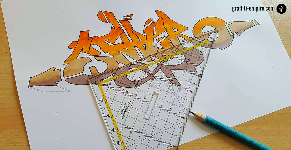
Fill the blocks with black color. If you want to create more complex 3D blocks, you can add light spots in the middle of the 3D block and fade the color to dark.
Step 5.1: Different Types of Coloring for 3D Blocks
If you make a gradient parallel to the outline, you will usually start from a brighter color and fade to a darker color in the back. The image above shows a gradient in blocks with additional parallel lines to the outline.
There are three ways to design the parallel gradient blocks.
- Color blocks
- Color blocks with lines (like shown above)
- A fading
Another fancy design for 3D-blocks is rounded block coloring on each block area, as is shown in the image above. Additionally, there can be a fading from bright in the middle to dark on the sidelines
Source: Basic ideas about 3D blocks – Reference: Graffiti School: A Student Guide and Teacher Manual – by Christoph Ganter
Step 6: Keyline and Background
The line around the whole graffiti is named “keyline”. In this case, I chose the complementary color to orange: blue. I added bubbles and drips in the same color as the background.
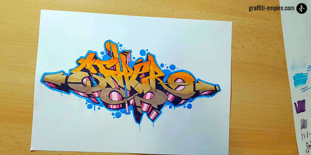
Step 7: Add Highlights, Your Tag and the Year of Creation
You can make your graffiti look more complex by adding shapes and light spots above the fill-in.
Common shapes are bubbles, rectangles, arrows, reflections and outlines of shapes.
Usually, these are colored in a darker color shade of the color used for the fill-in.
To complete your artwork, add your tag and the year of creation.
Congratulations! You finished your drawing! 🙂
4. Wrapping it up
I hope this tutorial helped you in your creative journey!
Is there something I forgot to mention or is there something you did not quite understand?
Feel free to drop a comment below.
What steps do you recommend for a wild style piece? Something more complex even…
that helped a lot but whats the taging stile?
your webpage and app are pretty awesome. 🎨
I love the tutorial
Thank you so much this helped my journing in graffiti
Been sleepin for the past 8 years since moving out of the Seattle. Now back in the an puttin in the work to grind off the rust. This step by step tutorial is really well made. I’ll definitely be using some of these tips you wrote about. Mad props, you did a great job on creating this entire how to draw a piece.
#sendit
#keepwriting
this is great
This helped a lot, Thanks.
Ive been obsessed with graffiti lettering, fonts, letter transition, balance, symmetry, proportion etc. And this page is really going to help me get thru that creative slump im in. Your amazing my friend.
Love It!!
Nice
cool
Thank you. it’s been a long time since I created graffiti and it helped me a lot.
Outstanding tutorial! This post is easy to follow as well as full of useful information . I have a good understanding of perspective view and light/shadow but i have always struggled with letters. The vanishing point has opened a whole new chapter for me.
This is amazing! I’ve been trying to start graffiti for a while but had no idea how! This has helped me so much
Excellent work you inspire me
Very good tutorial!
This website is cool
you should do some videos if you have not all ready, but either way your tutorials are awesome thanks a lot.
Loved it you really helped my pieces turn around I’m really happy where my skills are going
Thanks n8
It’s surprisingly difficult to find good step-by-step graffiti tutorials online – thanks so much for this one! I also really appreciate the alphabet library you’ve created!
Good stuff. Starting with the foundations is essential for beginners or they can drift aimlessly for years or just give up. It can also be helpful to old hands or people picking it again after a long break like myself. I found this tutorial a great little refresher. Thanks!
Sorry, I meant to give it 5 stars, but accidentally pressed it the wrong way. I really liked your tutorial! I’m going to use it for my ASA! Thanks a lot!!!
Hey, this post fortunately has lots of good reviews, so nevermind. Good to hear that you liked it! : )
how do you make a good letter were do i start
Check out our Android-App, it shows you how to create letters step by step:
Graffiti Empire App
Looking to get back into graffiti, which I’ve enjoyed since the early eighties. Gave up drawing it in art books for my own pleasure and recently been wondering why?! Thanks for the tutorial. Gonna be doing my first piece! Thank you : )
I am really happy to hear that! You are welcome! : ) Stay creative
Thanks u really did give me some serious guidance
Awesome
I love the tutorial – clear logical explanation with beautiful fitting examples. Thank you!