In this article, I will show you the concept of how I draw the graffiti shown in the picture below.
For an easy start for total beginners, you can also skip to one of the step-by-step graffiti drawing tutorials or our graffiti generator instead.

1. Basis: A Graffiti Tag
A graffiti tag is the basis of the design of a graffiti piece.
Think about a name you want to use as a sprayer. No ideas yet? Just start out with your real name!
We provide several designs for each letter in our graffiti letters collection. You can use it as a source of inspiration and draw your first graffiti tag this way.
I wrote a more in-depth article about graffiti tags and handstyles and how to construct them. You may want to check it out as well.
So, step by step:
- Get a marker (e.g. Montana); not a pencil; Tags look way better if you use the right marker – I used an acrylic Montana pump marker for the graffiti tag.
- Get a piece of paper
- Go to my collection of graffiti letters
- Search for the letters of your name
Example
I chose the word “Empire”
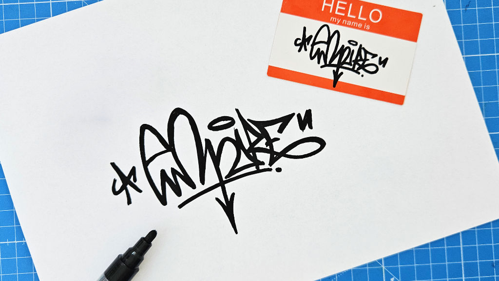
Attention: If you use markers, you should probably use a cutting mat. If you just write on paper, your marker will write through the paper on your desk!
Side note: If you search for a cutting mat on Amazon, please consider reading the bad reviews. If you find a review about bad oder coming from the mat there, do not buy this particular product. You cannot get rid of this smell. I also did not pay attention to it, when I bought my first cutting mat and I regretted that decision.
2. How to Draw Graffiti: Your First Graffiti Sketch in 7 Steps
Have you redrawn your first graffiti? Have you created your first tag? Nice!
So, let’s move on!
Graffiti pieces are very complex. To start out, I would recommend taking your tag and transforming it into a graffiti piece.
Every graffiti piece consists of the following parts:
- The fill-in: colored areas
- The outline: colored or black line around the fill-in
- 3D blocks
- A background
- Optionally A keyline: the line that runs around the whole piece
- The tag of the writer
- Optionally: highlights
- the year of creation
I use the following materials:
- A standard multipurpose copy printer paper for basic sketches and Bristol paper for more sophisticated sketches
- Staedtler Eraser
- Staedtler pencil – 2B grade
- Posca markers PC 1MR 0.7mm or Stabilo Fineliner for highlights and outlines
- Copic Markers Multiliner 0.5 for outlines
- Copic Ciao markers or Ohuhu brush markers for fill-ins
So, let’s get started:
Step 1: Trace Your Graffiti Tag
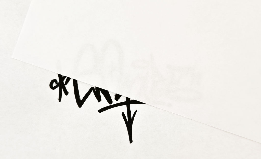
If you used a marker before, you will probably see the graffiti tag through the piece of paper to trace it. So, your first task is it to trace the edges of the lines with a pencil.
However, leave a little bit of space between the edge of the marker and your new pencil line so the letter gets bigger.
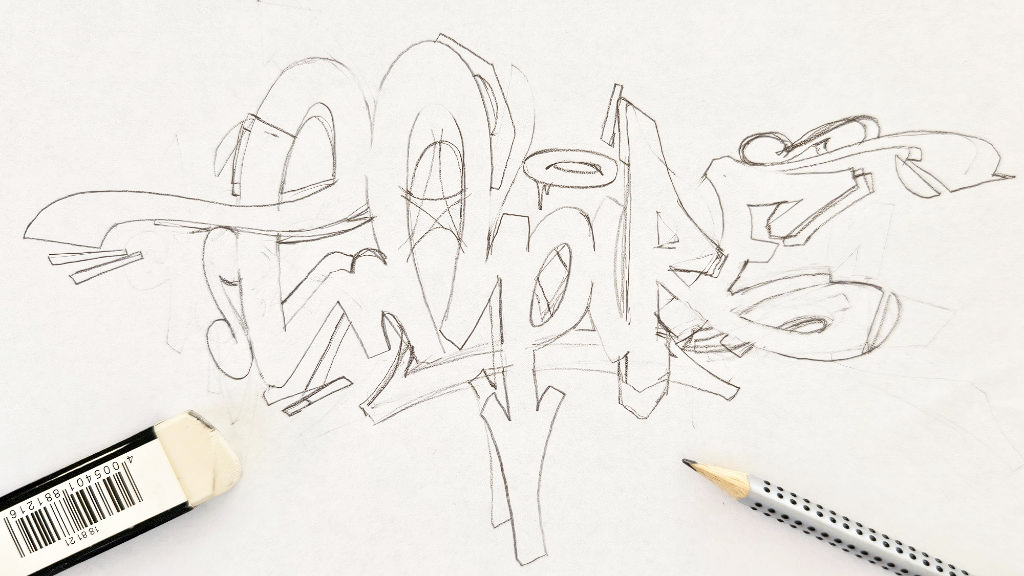
The result should look like the image shown below. This is not that bad, but we want to improve it.
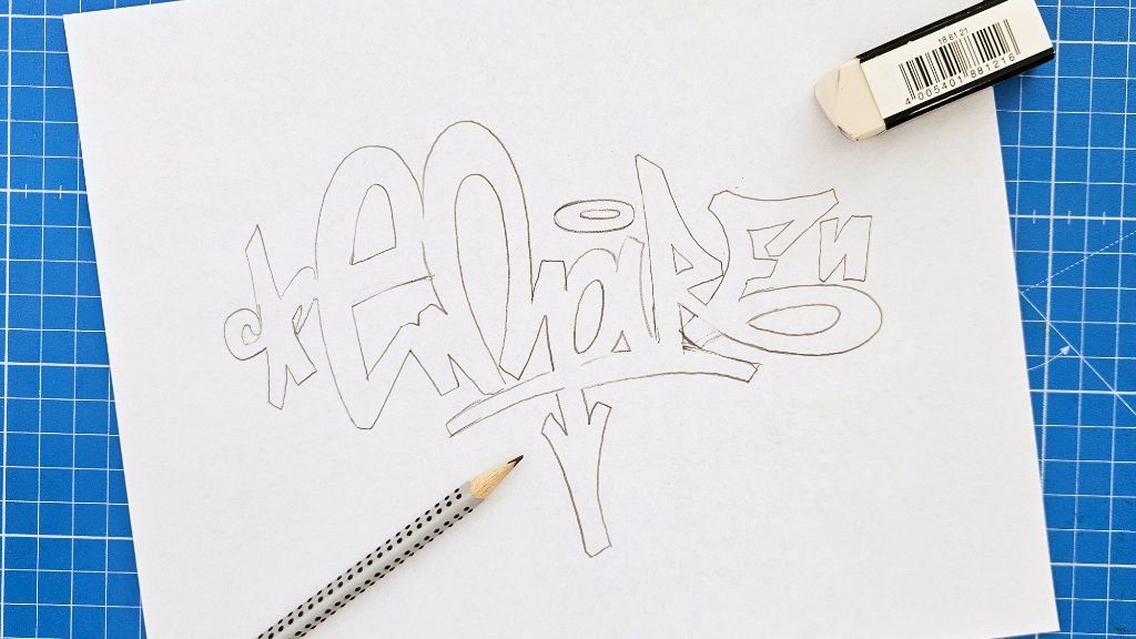
Step 2: Improve the Graffiti
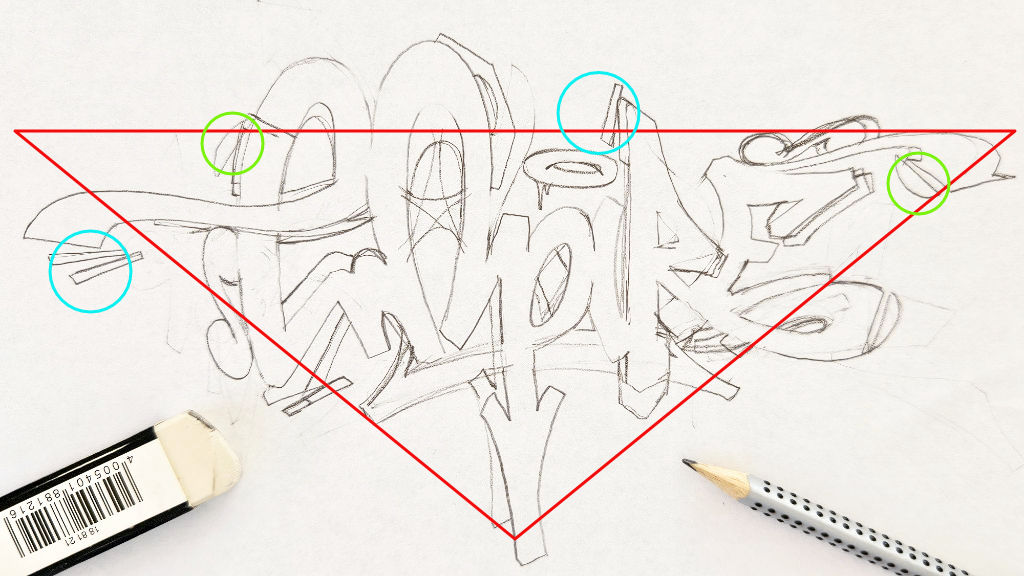
The composition of the whole graffiti is important as well. The arrow in the middle makes the form of the piece unproportional. So, I chose to put add-ons on both sides to create a compact form – a triangle. (red). I also added chips (blue circles) and lids (green circles) to make the graffiti more complex and add a feel of movement.
In typography, a serif is a small extra stroke attached to the end of the main vertical and horizontal strokes of a letter. In graffiti, you can use them to make your artwork look more complex.
The result looks like the image below.
This step is usually made by trial and error, and takes some time to master.
So, don’t be upset if the graffiti does not look like you imagined immediately.
Even if you practice drawing graffiti a lot, this step will take some time and you will have to use the eraser quite often.
Step 3: Redraw the Lines With a Fineliner
The next step is much easier. Take your Posca markers PC 1MR 0.7mm/ Copic Markers Multiliner 0.5/ Stabilo Fineliner and redraw your pencil lines.
Wait some time to let the color dry. Erase all the pencil lines afterwards. The result should look like this.
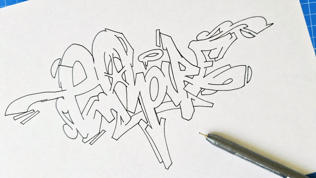
Tip: Copy your drawing at this point. If you are not happy with the colors you choose afterwards, you don’t have to restart the whole process again.
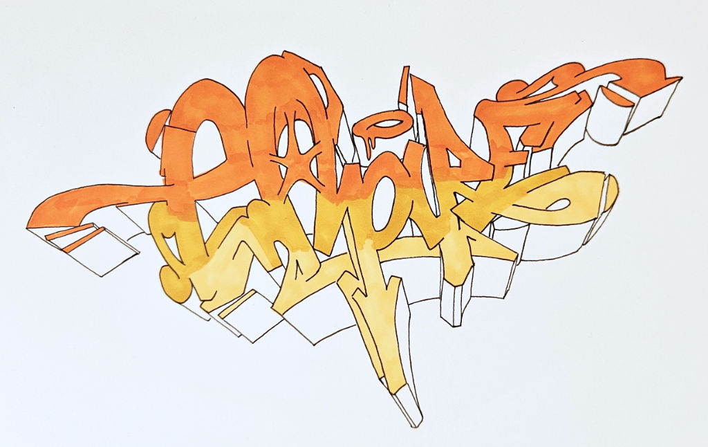
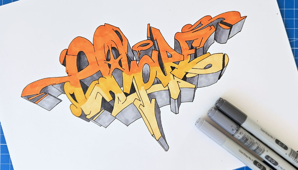
Step 4: Color Your Graffiti Sketch
To make the coloring look more complex, I would always recommend to draw gradients.
In this case, I colored the whole graffiti in one big gradient.
If you want to make your drawing to look even more complex, you will have to add a different gradient to each letter.
Step 4.1 Which Colors Should I Use?
In general, I recommend using complementary colors for either:
- Foreground and background
- Fill-ins and 3D blocks
If you want to use more colors, you should use colors of the same color shade.
You can also just search for a graffiti on Instagram or Pinterest and copy the colors. If you are a beginner, this approach will probably be the best.
Glossary
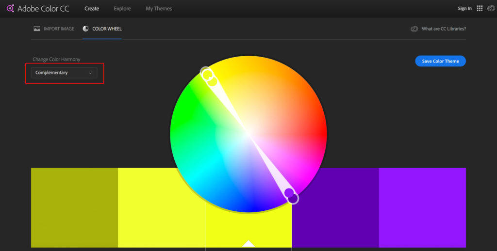
- Complementary colors: colors that are positioned opposite to each other on a color wheel
- Adobe Color CC is an example of a color wheel. Colors are placed on a circle based on a color theory. You can also use the Adobe Color CC color wheel as a tool to choose colors.
Step 4.2 Color theory
Well done color combinations are the basis of good fill-ins and coloring graffiti.
Using gradients is the secret of good coloring. Note that the gradient of the fill in is usually done by choosing 2-4 shades of one color.
The easiest way to find color combinations, is by going to the following website https://color.adobe.com/
You will find a color wheel there. Most of the color theories are based on color wheels. They just defer a bit from each other.
The strongest color contrast is known as “complementary contrast”.
So, just choose “complementary” in the dropdown menu in the top left of the website and adjust the wheel to find your preferred color combination.
Now use shades of one color for the fill in of your graffiti and the second color for the 3D blocks or your background/outlines.
Step 5: Drawing the 3D Blocks
One way of drawing 3D graffiti blocks is choosing a vanishing point.
This means choosing a point below or next to the graffiti where all the 3D blocks lead to, as it is shown in the picture below.
Next, choose how big the blocks should be. In this case, I selected 1,5cm (1/2 inches) in length.
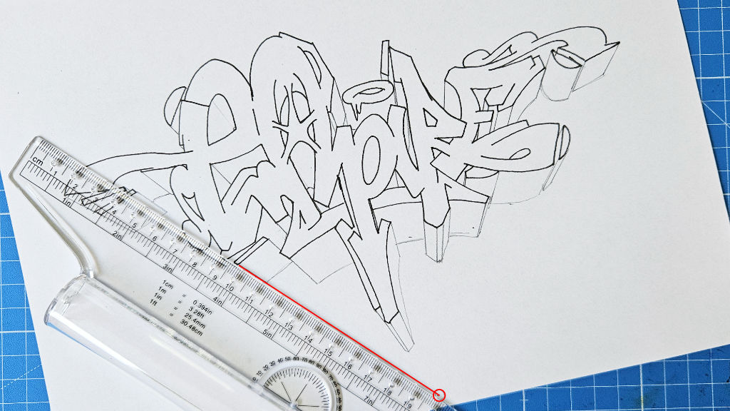
After that, take a ruler and draw a 1.5cm (1/2 inches) long line from every corner of the graffiti letters to the vanishing point. Connect the lines parallel to the graffiti outline. The results are 3D blocks.
Fill the blocks with black color or even shade them. There are quite a few approaches to color 3D blocks, which will not be discussed here.
Step 6: Background
I added bubbles and an explosion in the same color as the background.
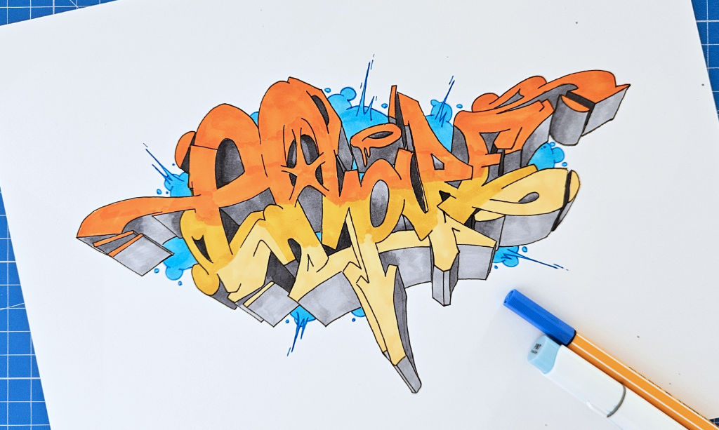
The line around the whole graffiti is named “keyline”. You may also want to add a keyline at this point.
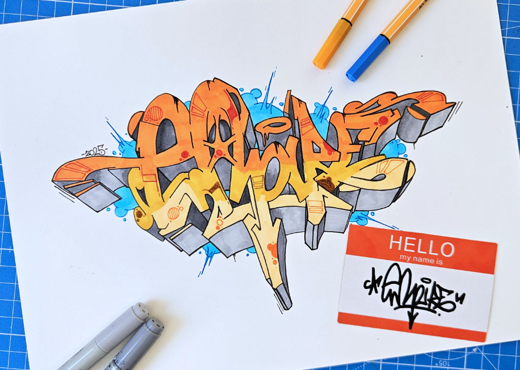
Step 7: Add Fill-in Details, your Tag and the Year of Creation
You can make your graffiti look even more complex by adding shapes and light spots (highlights) above the fill-in.
Common shapes are bubbles, rectangles, arrows, reflections and outlines of shapes.
Usually, these are colored in a darker color shade of the color used for the fill-in.
To complete your artwork, add your tag and the year of creation.
Congratulations! You finished your drawing! 🙂
4. Wrapping it up
I hope this tutorial helped you on your creative journey! Is there something I forgot to mention or is there something you did not quite understand? Feel free to drop a comment below.
So wickedly awesome:)
love your awesome work bro keep it up
This was awsome
brooo this was the best graffiti explanation ig i had. you described everything so good :O thanks! And the generator is also nice
good website
nice can u do more
cool